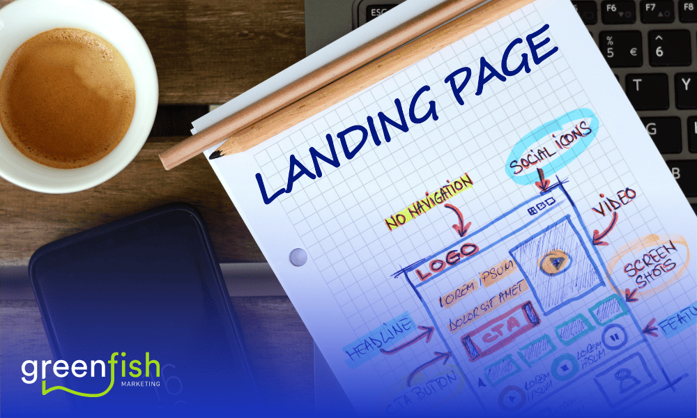
A successful digital marketing campaign hinges on having a landing page that has been optimised for conversion. To convert website visitors into customers, a landing page needs to be focused and purposeful. It requires a strategic approach, attention to detail, and an understanding of the key elements that make up a successful landing page.
Sales psychology plays a role in what makes a successful landing page. Don’t tell people how good you are, tell them how good their lives will be when they take the action you want them to. You need to speak to your audience’s needs.
Greenfish Marketing have sent millions of emails that have made business owners tens or hundreds of thousands of dollars and landing pages have been a crucial element.
In this article, we will dive deeper into each of the five proven practices we use and swear by for high converting landing pages.
1. A clear and compelling headline
Your headline is the first thing that visitors will see when they land on your page. It needs to be clear, concise, and encourage a (positive) action. A strong headline should convey the value proposition of your offer and entice visitors to learn more. Use action-oriented language and highlight the benefits of your offer to increase the chances of visitors converting.
To create a compelling headline, consider the following tips:
- Keep it short and sweet. Your headline should be no more than 10-12 words.
- Use power words and action verbs to create a sense of urgency.
- Speak directly to your target audience and address their pain points.
- Use numbers or statistics to provide context and credibility.
2. Use high-quality images and videos
Visuals are a critical component of any landing page. They help to reinforce your message and make your offer more engaging. Use high-quality images and videos that showcase your product or service in action. Avoid using stock photos or generic images that do not add value or resonate with your target audience. We understand they’re necessary sometimes but they can also look really fake and people don’t buy from businesses they don’t trust.
To create effective visuals, consider the following tips:
- Use images and videos that are relevant to your offer.
- Ensure that your visuals are high-quality and professional.
- Use real images of your product or service in action, if possible.
- Avoid using too many visuals that could distract visitors from your message.
3. Keep your message simple and focused
Your landing page should have a clear and focused message that is easy to understand. Avoid using industry jargon or technical language that may confuse visitors. Keep your message simple and concise, and focus on the benefits of your offer that helps people understand why this is the right thing for them. Use bullet points or short paragraphs to break up your content and make it more readable.
To keep your message simple and focused, consider the following tips:
- Use simple and straightforward language.
- Focus on the benefits of your offer, rather than the features.
- Address any potential objections or concerns that visitors may have.
- Use bullet points to break up your content and make it more scannable.
4. Use social proof to build trust
Social proof is a powerful tool for building trust with your audience. Use customer testimonials, case studies, or reviews to show that your offer has been successful for others. This can help to alleviate any concerns or doubts visitors may have and increase the likelihood of them converting.
To use social proof effectively, consider the following tips:
- Use real customer testimonials or case studies.
- Use specific and detailed examples that illustrate the benefits of your offer.
- Use social proof throughout your landing page, not just in one section.
- Use visual elements like photos or logos to increase the credibility of your social proof.
5. Create a clear call-to-action (CTA)
Your call-to-action (CTA) is the most critical element of your landing page. It should be clear, visible, and compel visitors to take your desired action. Use action-oriented language and make sure your CTA stands out visually. Avoid using generic phrases like “submit” or “click here” and instead use specific language that relates to your offer.
To create an effective CTA, consider the following tips:
- Use action-oriented language like “Download Now” or “Start Your Free Trial.”
- Make your CTA visually distinct from the rest of your content.
- Use contrasting colours to draw attention to your CTA.
- Place your CTA
We know this probably sounds a little too easy but making more money isn’t as hard as it’s often made out to be. Here’s one more final tip from us: make it streamlined. Think about where your customers came from to arrive on that landing page. Know where they are in your customer journey and use that information to make your landing page(s) really relevant to your audience.
If you’re serious about taking the steps to make more money, let’s talk. Book a complimentary strategy call with us to talk about how you can level up your digital marketing.


